-
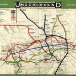
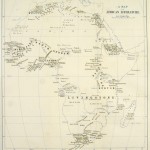
- Early Underground map, 1908 – before Harry Beck’s circuit diagram overhauled its geography, the free pocket maps were inconsistent and chaotic, although frequently beautiful. Because the lines were owned by different companies, they often refused to acknowledge the existence of other lines, making changing trains a lottery. Photograph: London Transport Musuem
-
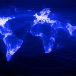
- Facebook’s world map In December 2010 Facebook released a new map of the world that was as astonishing as it was beautiful. Using the company’s central data on its members, an intern called Paul Butler had taken their latitudinal and longitudinal coordinates and linked those to the coordinates of the places where they had connections. Facebook had about 500 million members at that time, so Butler anticipated a bit of a mess; instead not only were the continents visible, certain international borders were apparent as well (but note the virtual absence of China). It was the embodiment of what Facebook founder Mark Zuckerberg had said. “The idea isn’t that Facebook is one new community, but it’s mapping out all the different communities that exist in the world already”. Photograph: Courtesy of Facebook
-
- The first A-Z The first A to Z Atlas and Guide to London and Suburbs with House Numbers Containing Large Coloured Map Giving 23,000 streets’ was published in the mid 1930s. Myth has it that its creator, Phyllis Pearsall, trudged along those 23,000 streets herself, painstakingly documenting them on index cards which she arranged in alphabetically order and kept in shoe boxes. The reality was more prosaic; she relied primarily on information from the Ordnance Survey and local councils. The map was rejected by most outlets apart from WH Smith which ordered 1,250 copies. Within weeks, she was receiving orders from every railway station bookstall in the south of England. Photograph: Cassini Publishing
-
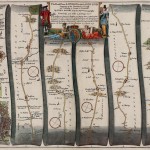
- John Ogilby’s route from London to Cornwall After the Great Fire of London, it became an imprisonable offence to depict the damage caused by the fire, but sketches and plans for a new city were widely encouraged, and several mapmakers set to work. Ogilby was by far the most ambitious. A large and Accurate Map of the City of London Ichnographically Describing all the Streets, Lanes, Alleys, Courts, Yards, Churches, Halls and Houses … was first sold in January 1677. But this was only part of his grander Britannia project, a collection of 100 lavishly designed strip maps (the image here shows a detail of the route from London to Cornwall). They contained not only distances, but also suggestions as to where to stop for the night. It was one of the very first road atlases, and much copied. Photograph: Courtesy of Profile Books
-
- The New Simplified Map of London The digital revolution may have transformed mapping, but even in the age of the infographic, sometimes it’s the simplest, quirkiest hand-drawn maps that reveal the grreatest truths, like this one created by a user on a Flickr site devoted to ‘maps from memory’. Photograph: Ellis Nadler
-
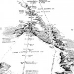
- Amundsen’s route to the pole Antarctica has long been described as the last place on earth to be mapped, and vast areas remain cartographically white and silent. This map, compiled by Englishman Gordon Home from telegraph reports, appeared in a book by Roald Amundsen published in 1912. Its principal attraction is narrative, with the map serving as a vivid adventure diary. Members at the Royal Geographical Society would not have been amused by the fact that Scott and Co had apparently yet to reach the pole. Photograph: Courtesy of Profile Books
-
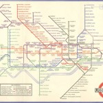
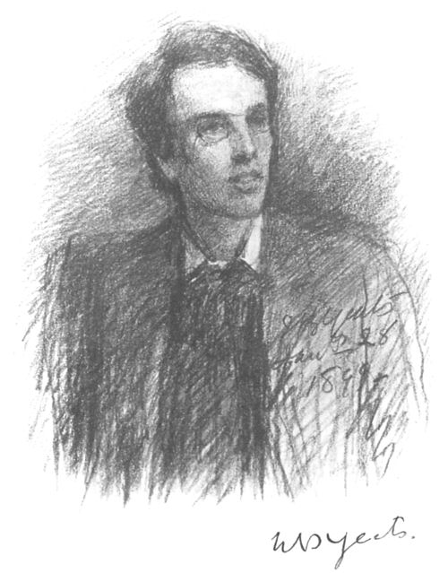
- Beck’s circuit diagram of London Underground Harry Beck’s graphic and non-geographic interpretation of the underground network, for which he was paid a few pounds, has become one one of the most enduring symbols of London. Only a map in the loosest sense, it has inspired many artists and satirists to create their own interpretations, most famously Simon Patterson’s Great Bear from 1992, which replaced station names with footballers, philosophers and Hollywood film stars. Photograph: London Transport Musuem
-
- Literature of Africa William Winwood Reade drew this thematic map of the Literature of Africa, a textual display showing where the key explorers of the late-eighteenth and nineteenth centuries had travelled – one of the earliest infographics. David Livingstone, the first to traverse the central width of the continent, straps the map like a belt, while Mungo Park and the French explorer Rene ‘Caillie’ both curve around the Niger. Stanley had located the fading Livingstone near the shore of Lake Tanganyika by the time the map was drawn, but he was yet to set off on his own big discoveries to Lake Victoria and beyond, so barely features. Photograph: Courtesy of Rare Books Division, Princeton University Library
-
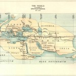
- The World According to Eratosthenes Eratosthenes (born 276 BC) began his treatsie Geographica shortly after becoming the third Librarian at The Great Library of Alexandria. His world map was drawn in about 194 BC. No contemporary version exists, this reproduction was made for a Victorian audience. Resembling a dinosaur skull it shows three recognisable continents: Europe to the north-east, Africa (described as Libya and Arabia) beneath it and Asia to the east, with the equator running through Rhodes. Photograph: Courtesy of Profile Books
-
- Nancy Chandler’s 3D map of Bangkok Numerous academic studies have found no truth in the stereotype about men being better map readers than women. But some conclude that men design maps for other men, and that women read maps differently, using landmarks and fixtures to navigate, rather than broad spatial cues (large areas and flat lines). Nancy Chandler has been producing highly successful ‘3-D’ maps of Thailand for the past two decades. They look crowded and chaotic but feature hand-drawn landmarks and useful text, as well as colour coding for different attractions. Her maps are bought and used predominantly by women. Photograph: Courtesy of Nancy Chandler, nancychandler.net

-
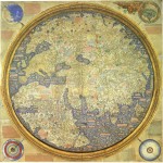
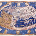
- The Fra Mauro map of the world Mauro lived and worked on the Venetian island of Murano. His map of the world contains almost three thousand place names and a vast amount of explanatory text, and although it contained the usual misplaced rivers and regions, it is seen as a geographical masterpiece. Hovering between the old world and the new, and between the medieval depiction of the earth as one round planisphere and the dual-hemisphere projection that emerged in the sixteenth century. Naval and trade charts drawn on his own travels were used in its making, but the descriptions of China, Japan and Java derived primarily from the travels of Marco Polo. A copy of the original, made for a Venetian lord, is displayed in the Biblioteca Marciana in Venice. Photograph: Courtesy of Profile Books
-
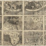
- Waldseemüller map Consisting of 12 woodblocks, each showing a different section of the world, the Waldseemüller map, named after its principal draftsman, is roughly 8ft by 4ft when pieced together. Perhaps a thousand were printed at the beginning of the sixteenth century but only one copy survives, bought in 2003 for $10m – the highest sum ever paid for a single map – by the Library of Congress in Washington DC. Photograph: Courtesy of Profile Books
-
- Waldseemüller’s map Made in 1507, Waldseemüller’s map included a new continent in the western hemisphere: controversially named America (and not Columbus), and described as a land “of which the ancients make no mention.” America was named after Amerigo Vespucci, a Florentine navigator who for a while worked for a bank in Seville that provided some of the funds for the early voyages of Christopher Columbus (Waldeseemuller was influenced by letters circulating at the time suggesting Vespucci landed on South America first). In a later map he labels South America Terra Incognita, but it was too late – the name America had already begun to appear on other maps, and it stuck. Photograph: Courtesy of Profile Books
-
- Ptolemy’s classic map of the world Claudius Ptolemy, who lived between 90 and 170 AD, was arguably the world’s first modern cartographer, with his Geographia listing thousands of cities and other locations. This interpretation of his map of the world, rendered in 1482 by German engraver Johannes Schnitzer of Armsheim, was drawn up along scientific principles – with lines of longitude and latitude, and a clear understanding of the spherical shape of the earth. Photograph: Courtesy of Profile Books
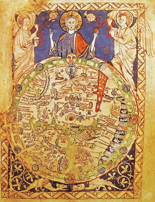
Early maps of the world were religious icons, just like those icons on the carpet page of the Book of Kells.
This 12th Century map of the world is called a “T and O” map because of the shape of the image. The world it portrays is a circle, divided by a T-shaped cross, the centre of which is in Jerusalem. The circle represents perfection. The world as the object of God’s affection. The world is is divided into three continents, named after the sons of Noah. This map represented the Church’s truth. It conveyed everything important to know for those who lived in a world where nature was unfolding according to God’s plan.
As maps, these may have represented the veneration of God, but neither was useful as a tool for travel. Even though this second image is from the 15th century, it retains the same, iconic and religious qualities of the early manuscript books. The world is still three continents, named for the sons of Noah. While the later version of the “T and O” map shows a more naturalistic view, the continents are represented by representations of real people, there is still no sense of perspective in the image.
The ideological content of the map remains the same as the 12th century version, with a view of the Ark at the top of the map.
Alongside the development of manuscript books with a focus on the outside, secular world, maps begin to evince similar concerns. Although this map predates the last the 15th century map, it shows a rising secular concern in its representation of the world. For instance, it shows India, just below the Garden of Eden. It also has real rivers and real, named places, in geographical relations to each other, all existing along side the religious icons.
The information on early manuscript maps that try to represent the world is drawn from traveller’s reports of their journeys. Representations of Europe tend to be accurate but outside Europe, where the world was less well-known, the map gets less accurate. In the case of this image, from the Catalan Atlas of 1375, Europe is fairly well laid out, while China and the East, known primarily at the time from the travels of Marco Polo (whom this map shows), is less well defined.
Here is a later map, by Ptolemy. The impulse in this kind of map making is toward an accurate representation of the world, an impulse toward creating information that can be used to navigate in the world.
Ptolemy’s map was represented the state of understanding of the world until Columbus’s journey in 1492.
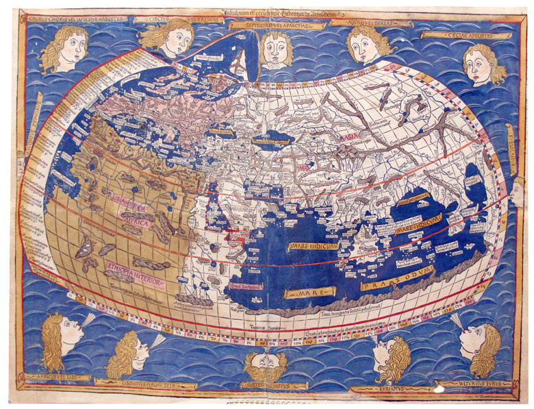
As mentioned above, the earliest secular texts to be printed were the works of Greek and Roman antiquity. This is a modern reproduction of a map of Ptolemy, a 2nd century geographer and astronomer. The reproduction of this map was part of an emerging humanist tradition, an attempt to reproduce classical manuscripts, not to spread useful information. On this map, Africa is represented as part of the “Southern Continent”. This was inconsistent with the state of geographic knowledge at this time. Far more was known about the west coast of Africa because Henry of Portugal (Henry the Navigator) had begun sending ships down the coast of Africa in the early 15th century. This was not intended to be an instrument for navigation.
Other manuscript maps contained real geographical information, albeit not necessarily to geophysical scale. On this map, India, the Cantino World Map created in about 1502, the centre of the spice trade, is enlarged in proportion to its economic importance to the world at the time.
These maps show another kind of distortion as well. In the early 1500s, the Pope divided the known world into Spanish territory and Portuguese territory. Depending on the politics of the map makers, different areas of the world might be shifted one way or another, placing them in either Spanish or Portuguese territory.
In the early years of the exploration of the New Worlds, all geographic information was collected by Portuguese and Spanish explorers. The information they gathered was tightly controlled by their governments because control of accurate geographical information meant control of important political, economic resources and the world.
By controlling this information, the Iberians managed to keep the British and the French out of the expansion of the early 16th century because they didn’t have the necessary information.
When the Dutch managed to pull away from Spanish control, they became a centre for the reproduction of geographical information. They learned cartography under the Spaniards and had collected that information in Holland. This is a world map printed in 1570 by Abraham Ortelius , 1527-1598, entitled, Theatrum Orbis Terrarum.
Once freed from Spanish control, the publication of maps engendered the same kind of comparison between texts (maps) as that for scientific texts. Once the Dutch provided these maps to the British and French, their further exploration of the world produced more information against which current maps could be compared and updated, ruining Iberian control of the New World territories.
This exploration, exchange and comparison of information, both in maps and in printed books, changed Europe’s view of the world. The world was once a place once largely unknown represented by the Greek mythological image of Atlas carrying a huge globe on his shoulders Now, in the most famous atlas of the period, Mercator’s Atlas of 1595, Atlas plays with the earth like a basketball. The globe has become manageable, controllable, a resource to be exploited, no longer the realm of the unknown.
Modern maps, showing the world in ways that allowed a reader to leave home and return, also allowed for European expansion into the new world, and the creation of a European-centred world economy.
The new world economy was characterized by a system of nation states in economic competition with each other. The critical aspect of the period was that no one of these states was strong enough to dominate the others. Together, these states produced a world economy. However, unlike earlier empires like the Hapsburg empire, where the fate of the economy was dependent on the stability of the empire, in this new world system, the economic system would continue when a state or government died. It no longer mattered which states were involved in that competition, the economic activity would be sustained because there was no one dominant political group.
What arose was an economic system of unparalleled stability that lasted well into the Industrial Revolution and beyond. Hudson’s Bay Company is still in business in Canada and there are probably still vestiges of the East India Company, founders of the British Empire, in corners of the globe.
Image credit:
Maps through the ages – in pictures
In his new book, On the Map: Why the World Looks the Way it Does (Profile Books), Simon Garfield charts the history of maps, from the early sketches of philosophers to the infographics of the digital age, and what they tell us about the way we see the world